Colors of an app icon - 2022 edition
Published 1st November, 2022 by Stuart HallIn this guide we will cover:
- Refinements from the previous study
- Color Groupings
- Limitations of the analysis
- Top 200 Free iOS Apps
- Top 200 Paid iOS Apps
- Top 200 Grossing iOS Apps
- Top 200 Free Google Play Apps
- Top 200 Paid Google Play Apps
- Top 200 Grossing Google Play Apps
- Key takeaways
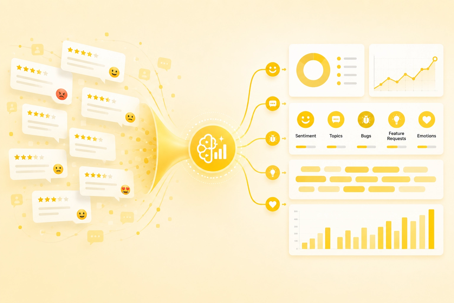
Want to see feedback on your icon in your app reviews?
Try Appbot free now, no credit card needed →The Analysis Technique
Refinements from the previous study
There were several flaws with my investigation 7 years ago that I was never happy with.
- I completely ignored white and black app icons
- Icons were still plotted on the color wheel even if they had no dominant colors
Color Groupings
This time around I decided to just focus on the main dominant color in each icon. I also decided to group them into 4 categories:
- Mainly white icons
- Mainly black icons
- Other icons with at least one dominant color (>25% of the image) to show on the color wheel
- Mixed icons (no one color is 25% of the icon)
Limitations of the analysis
There are a few spots where the analysis falls down:
- Gradients - the algorithm see multiple colors, so won't detect these well
- Transparency - Google Play icons can be transparent. I've assumed white background in these cases
- Multiple icons - this analysis only looks at the default icon
iOS app icon colors
I looked at the top charts (free, paid and grossing) for iOS in early September 2022. Interestingly, the results did vary.
Top 200 Free iOS Apps
The top free charts contain a lot of white icons. Google loves a white icon. Some of the 'newer' social networks like TikTok and BeReal have black icons. There's a pretty even spread through the usual suspects of red, green and blue.
Top 200 Paid iOS Apps
Paid apps have noticeably fewer white icons but a similar representation of black icons. There are a lot more 'mixed' icons without a dominant color, mainly due to more games being represented. There's a real wasteland in pink for paid apps.
Top 200 Grossing iOS Apps
The top grossing charts continue the trends of the top paid apps. However, due to the domination of games in the top-grossing charts, there are even more 'mixed' icons.
Google Play app icon colors
I also looked at the top charts (free, paid and grossing) for Google Play.
Top 200 Free Google Play Apps
The free charts on Google Play look very similar to iOS. Unsurprisingly, many apps are the same with the same icon. There's a similar number of white, black and mixed icons.
Top 200 Paid Google Play Apps
Again this chart is similar to iOS. There are slightly more black icons on Google Play. However, there appears to be much less green in use.
Top 200 Grossing Google Play Apps
Again, the top-grossing chart is similar to iOS. It is very game-dominated so we see a lot of mixed icons.
Key takeaways
- Apps, especially social media apps, like to use a white or black background in their app icon on iOS and Google Play.
- Black backgrounds are more prominent for app icons.
- Games tend to use a lot of color and detail in their app icons.
- Blue, red and yellow are popular app icon colors. Green is more popular on iOS than Google Play.
- Few top charting apps use pink app icons.
- Since 2015 there has been a trend towards white and black app icons, but overall not a lot has changed.
Want to see feedback on your icon in your app reviews?
Try Appbot free now, no credit card needed →Where to from here?
- Get inspired by real app description examples that captivate users and drive downloads.
- Learn from 5 star review response examples to engage with your happy customers and build a loyal user base.
- Dive into the secrets of creating addictive apps that keep users hooked and coming back for more.
- Discover effective strategies for app review management to efficiently handle and leverage user feedback.
About The Author

Stuart is Co-founder & Co-CEO of Appbot. Stuart has been involved in mobile as a developer, blogger and entrepreneur since the early days of the App Store. He built the 7 Minute Workout app in one night and blogged the story of growing the app to 2.3 million downloads before exiting to a large fitness device company. Previously he was the co-founder of the Discovr series of applications which achieved over 4 million downloads. You can connect with him on LinkedIn.
Enjoying the read? Check out our more recent posts
 Why Generic AI Isn't Enough for App Ratings and Review Feedback Analysis
 Learn why generic AI alone isn't enough for customer app feedback analysis and how combining LLMs with structured customer intelligence delivers more reliable product insights.
We analyzed 15,512 Claude app reviews after the launch and withdrawal of Claude Fable 5. Discover what ratings, sentiment, emotions, topics, and keywords revealed about user reactions.
Discover how WWDC 2026's Personalized Collections, App Notes, and AI-powered App Store recommendations could reshape ASO, app discovery, and growth strategies.
Apple’s Liquid Glass redesign is coming to apps across the ecosystem. Learn what past redesigns reveal about user feedback, App Store reviews, and how product teams should respond.