What Banking App Reviews Reveal About Fintech in 2026 (And What Product Teams Should Do Next)
Published 18th February, 2026 by Stuart Hall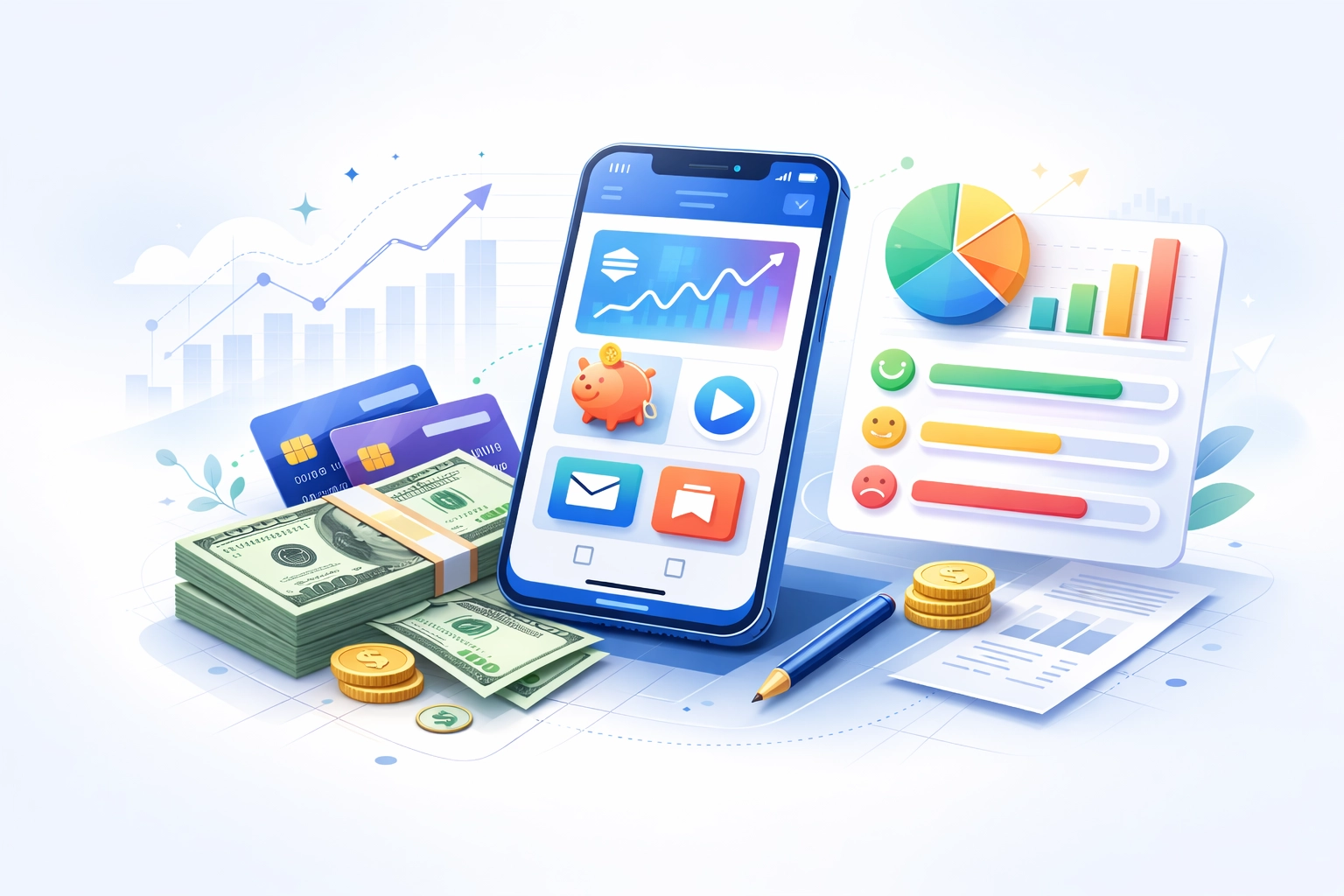 In 2026, banking app reviews offer one of the clearest windows into how fintech is evolving. Across App Store ratings and reviews, consistent patterns show that the biggest drivers of ratings are not new features, but moments of clarity or uncertainty. This guide explores what mobile banking app reviews reveal about digital banking UX, common product mistakes, and the patterns shared by the highest-rated finance apps.
 What we cover:
- The Pattern Behind Modern Banking App Reviews
- A Clear Divide: Digital Banks vs Legacy Banks in Reviews
- Banking Apps Are Becoming Financial Coaches
- AI Only Matters When It Reduces Effort
- Common UX Mistakes Revealed by Banking App Reviews
- What High-Rated Banking Apps Consistently Do Differently
- The Deeper Insight
- What Product Teams Should Learn
- Final Thought
Want to monitor & track your app reviews?
Try Appbot free now, no credit card needed →Most mobile banking apps now offer similar core functionality. Users can check balances, send payments, freeze cards, and track spending across nearly every modern finance app. Yet ratings vary widely.
The difference isn’t functionality. It’s experience.
Analysis of banking app reviews shows that users rarely ask for more features. Instead, they want fewer moments of uncertainty with clearer interfaces, transparent security decisions, and smoother everyday interactions.
The Pattern Behind Modern Banking App Reviews
If you read and analyse enough raw app reviews a clear pattern begins to emerge
- “Why is it asking me to verify again?”
- “Where did my transaction go?”
- “It says pending but gives no timeline.”
- “Why was my account frozen with no explanation?”
Individually, these moments feel small. Collectively, they shape ratings.
Users reward clarity. Users punish uncertainty.
A Clear Divide: Digital Banks vs Legacy Banks in Reviews
One consistent pattern appears when comparing digital-first banks and traditional institutions. Reviews for digital banks frequently include language like:
- “simple”
- “instant”
- “easy to use”
- “finally makes sense”
Legacy banking apps more often receive comments such as:
- “confusing”
- “hard to find”
- “too many steps”
- “slow”
This difference isn’t necessarily about features. It reflects the design philosophy, reducing cognitive effort versus preserving legacy complexity.
Banking Apps Are Becoming Financial Coaches
Highly rated reviews rarely celebrate advanced features. Instead, users praise apps that make them feel informed and in control.
“Easy to use, great features, and genuinely customer focused.”
The real shift isn’t technical - it’s emotional. Users value understanding over complexity.
AI Only Matters When It Reduces Effort
AI dominates fintech marketing, but in reviews it’s mostly invisible unless something breaks. Users respond positively when automation:
- reduces steps
- saves time
- simplifies decisions
They react negatively when updates introduce extra friction or disrupt familiar workflows.
Common UX Mistakes Revealed by Banking App Reviews
Authentication Loops
- “Changed phones and now I can’t log in.”
- “Face ID stopped working after update.”
Access issues generate outsized frustration because banking apps are essential to daily life.
Unclear Payment States
- “Money left my account but doesn’t show anywhere.”
- “Pending with no explanation.”
The issue isn’t speed, it’s unclear expectations and ambiguity.
Disruptive Updates
Users frequently react strongly when familiar workflows change:
- “Used to take two taps, now I can’t find it.”
- “Why change something that worked?”
Security Without Explanation
- “Account frozen with no reason.”
- “Payment declined but no explanation.”
Users accept friction when it’s explained. They resist it when it feels arbitrary.
What High-Rated Banking Apps Consistently Do Differently
Instant Feedback Loops
- “I get a notification the second I spend anything.”
- “Always shows exactly what’s happening.”
Fewer Cognitive Steps
- “Everything is where you expect it.”
- “Very straightforward.”
Transparent Security Communication
High-rated apps explain why actions happen and what to expect next.
Stability Over Novelty
- “Never crashes.”
- “Always works.”
The Deeper Insight
The difference between high-rated and low-rated banking apps isn’t feature lists, it’s consistency, transparency and predictability. Lower-rated apps generate reviews filled with uncertainty. Higher-rated apps generate reviews filled with clarity and reassurance.
What Product Teams Should Learn
- Clarity reduces decision anxiety
- Predictability builds trust
- Transparent communication lowers support load
- UX stability improves retention
Clarity isn’t just UX polish. It’s growth strategy.
Final Thought
Banking app reviews provide one of the clearest windows into the future of fintech. The strongest finance apps don’t compete on complexity. They compete on reducing uncertainty.
The real question isn’t - What feature should we build next?
It’s - Where are users still unsure and how can we remove that friction?
Want to monitor & track your app reviews?
Try Appbot free now, no credit card needed →Where to from here?
- Explore the strategies employed by top grossing apps and learn how to achieve success.
- Master the art of writing an irresistible app store description that captures attention and drives downloads.
- Start replying to reviews faster with Appbot’s Reply to App Store Reviews tools.
- Dive into the secrets of creating addictive apps that keep users hooked and coming back for more.
About The Author

Stuart is Co-founder & Co-CEO of Appbot. Stuart has been involved in mobile as a developer, blogger and entrepreneur since the early days of the App Store. He built the 7 Minute Workout app in one night and blogged the story of growing the app to 2.3 million downloads before exiting to a large fitness device company. Previously he was the co-founder of the Discovr series of applications which achieved over 4 million downloads. You can connect with him on LinkedIn.
Enjoying the read? You may also like these
 App Push Notification Best Practices for 2026 (and the mistakes that drive users away)
 Push notification best practices for 2026, backed by research and real app reviews and the mistakes that quietly drive users away.
Discover how Hank Green’s Focus Friend app is winning over users with its cozy design, emotional resonance, and sky-high ratings. A deep dive into what’s driving its viral success.
Learn how Apple’s Product Page Optimization lets you A/B test app store screenshots, videos, and icons to improve conversion rates and app installs.
Great app ideas don’t start with features - they start with solving problems. Learn how to uncover, validate, and act on everyday pain points that lead to successful apps.